
Typography
Our typographic system is rooted in one typeface, Inter Display. It brings rigor and consistency to every product screen, and room to push type into bold, expressive forms when the story calls for it.
Inter Display
Data(Intelligence)↗4.2x*
[Design] €£$!
©2026
Our typeface.
Inter Display by Rasmus Andersson.
Inter Display is a neo-grotesque sans serif drawn for screens. Its tall x-height, open shapes and wide set of weights let it work at every size, from a 96px headline to a 12px label.
We use three weights: Regular for the voice, Medium for structure, Bold for product titles.
ABCDEFGHIJKLMNOPQRSTUVWXYZ
abcdefghijklmnopqrstuvwxyz
0123456789 &@%$€£?!→
Distinguishing attributes
Everyday usage.
Regular and Medium do most of the work.
Regular and Medium are our defaults for typesetting. A clear hierarchy of two weights removes guesswork and keeps the brand recognisable. Use this register wherever clear communication matters more than typographic expression.
Typesetting here should be rigorous and detail oriented. For leading and tracking, see Typesetting.
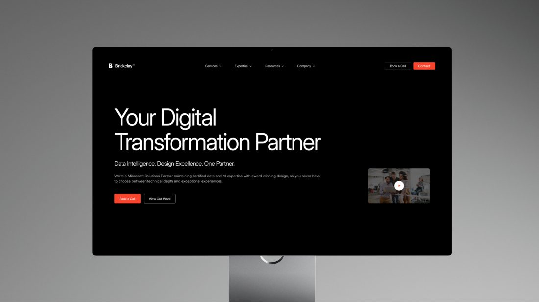
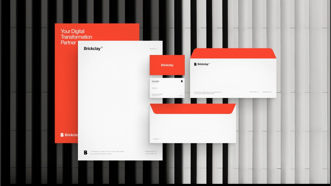
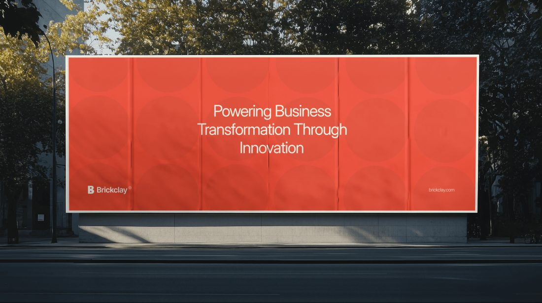
Turning scattered data into one clear view
We rebuilt reporting for a retail group so every team reads the same numbers, every morning.
Read the story →- Eyebrowlabel-sm · 12px · Medium
- Headlineheading-xl · 48px · Regular · -1.5px
- Bodybody-lg · 18px · Regular
- Linklabel-md · 14px · Medium
Expressive usage.
Type as a graphic object.
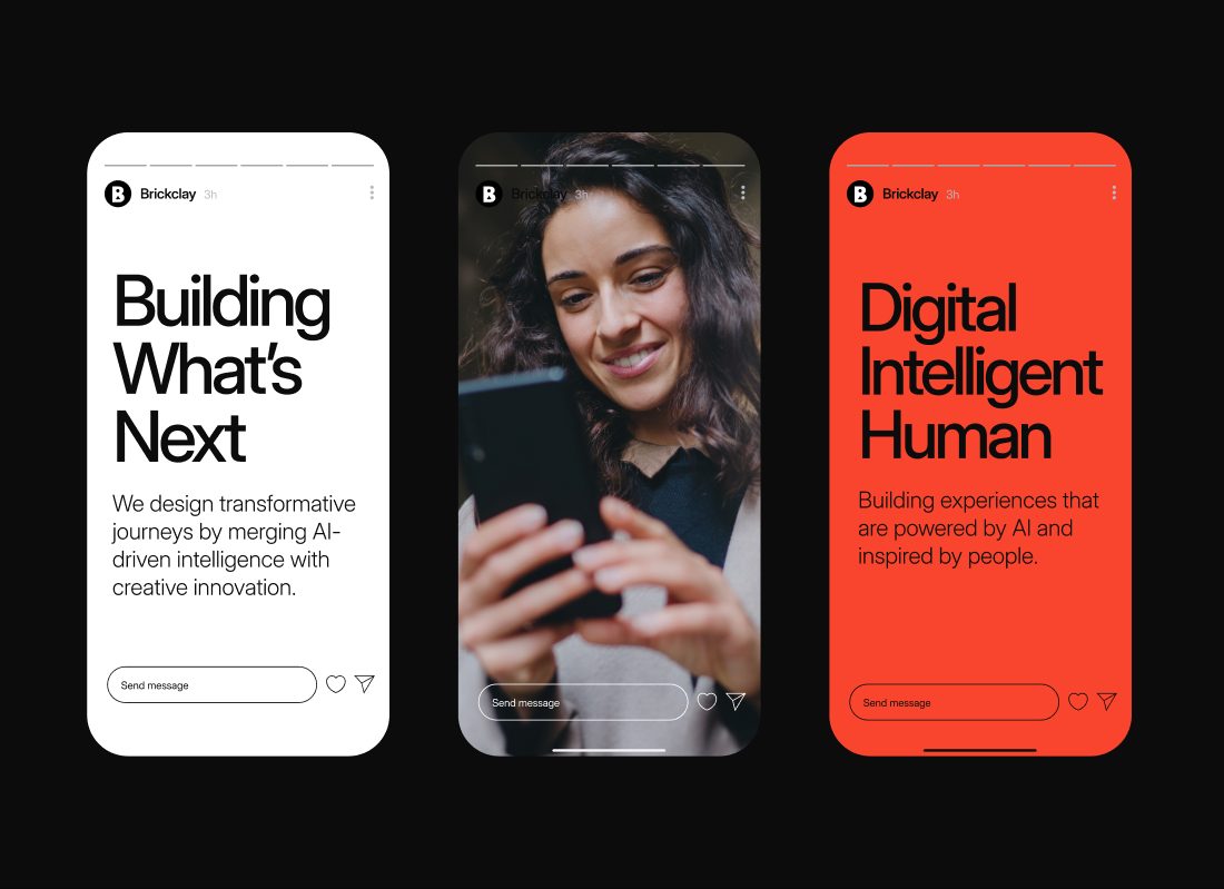
For campaigns, social and events, leading and tracking can be read more loosely. Type becomes its own graphic element, pushed to create bold compositions. Always consider how the type sits with photography, motifs and the logo.
Ask yourself: does the type feel integral to the layout? Does it still read at a glance?
- Scale→
- Spacing→
- Repetition→
- Contrast→
- Orientation→
- Legibility→
what’s
next.
creativity.
Balance
Beyond
Digital, intelligent, human.
Typesetting.
Leading, tracking, kerning, hierarchy.
Good typesetting is invisible. These ranges come straight from our type tokens.
Leading
Display lines sit between 100% and 115% of the type size. Headings open up to about 140%, and body copy to about 155%.
over
trends
over
trends
over
trends
Tracking
The bigger the type, the tighter the tracking. Body and labels stay at 0.
Kerning
Keep the font’s built-in kerning on everywhere. Adjust pairs by hand only on display lines above 96px.
Hierarchy
Two scales share one typeface. Expressive is for marketing and storytelling, Productive for screens and tools.
Typeface features.
OpenType, switched on with purpose.
Inter Display ships with OpenType features that solve real problems in product and data work. Left is the default, right is the feature on.
font-feature-settings: "tnum"9,876.541,111.11
9,876.54
font-feature-settings: "frac"font-feature-settings: "case"font-feature-settings: "zero"font-feature-settings: "ss02"font-feature-settings: "calt"Incorrect usage.
Keep the system intact.
- Bold headlines
- Wide capitals
- Faux italics
- Stretching
- Low contrast
- Other typefaces
Languages.
Latin, Greek and Cyrillic.
Inter Display covers Latin, Greek and Cyrillic scripts, including Vietnamese. For scripts it does not cover, such as Arabic or Urdu, use the platform’s system font at matching sizes.
We design systems that scale.
Diseñamos sistemas que crecen.
Wir gestalten Systeme, die wachsen.
Nous concevons des systèmes évolutifs.
Ölçeklenen sistemler tasarlıyoruz.
Σχεδιάζουμε συστήματα.
Мы создаём системы.
Chúng tôi thiết kế hệ thống.
Resources.
Everything you need to set type.