








Primary palette.
Three colours carry the brand.
Brickclay Red is the signature accent, Brickclay Black (#0C0C0C) replaces pure black, and white gives the work room to breathe.
Brickclay Red leads, black and white do most of the work. Every color has a job, and every text pair is checked for contrast before it ships.
The hero colour, used with intent.
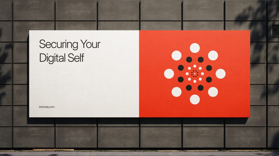
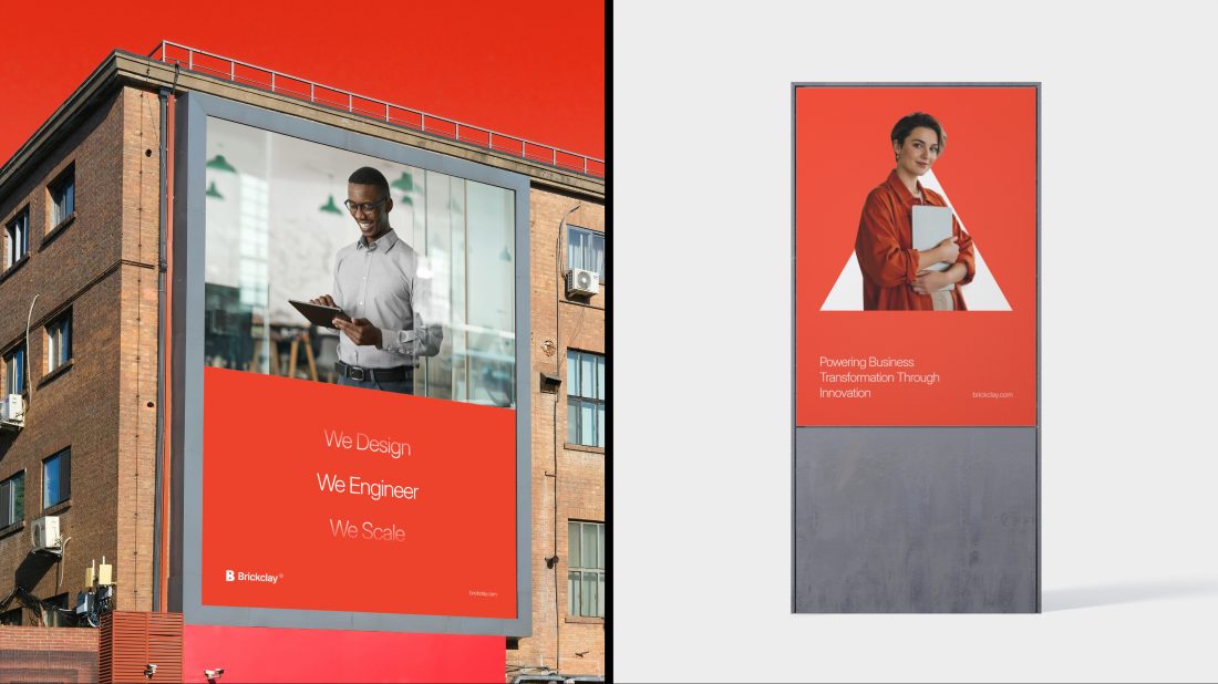
Brickclay Red should be present at every touchpoint and used with intent, so it always reads as the hero color.
Full red floods are powerful, but they are not the only way red shows up. Let it arrive through a single shape, a frame, a stage light or a material, and keep black and white around it so it stands out where it matters most.


Three colours carry the brand.
Brickclay Red is the signature accent, Brickclay Black (#0C0C0C) replaces pure black, and white gives the work room to breathe.
Tints and shades for hovers, fills and text.
red-400 is the primary button hover; red-700 is the red for text and links on white.
#FEDAD5#FDB5AB#FB8F81#FA6A57#F9452D#C73724#95291B#641C12#320E09Greys for surfaces, borders and secondary text.
neutral-600 is the lightest grey allowed for text on white (5.17:1).
#FFFFFF#F8F8F8#EBEBEB#CECECE#9E9E9E#6D6D6D#3D3D3D#1C1C1C#0C0C0CFive supporting pairs from the brand deck.
Use the pastel as a surface and the dark step for text, icons and chart series. The mid step is for marks on dark backgrounds.
purple-100 #F4E9FFpurple-400 #A06ADDpurple-700 #7226CAmint-100 #DBF7F2mint-400 #5AA992mint-700 #157F5Etruffle-100 #FDF4C8truffle-400 #CC8B47truffle-700 #B25302teal-100 #DAEAFEteal-400 #6084E3teal-700 #1E4DD5burgundy-100 #FCDFD9burgundy-400 #C96557burgundy-700 #AD24114.5:1 for text, 3:1 at 24px and larger.